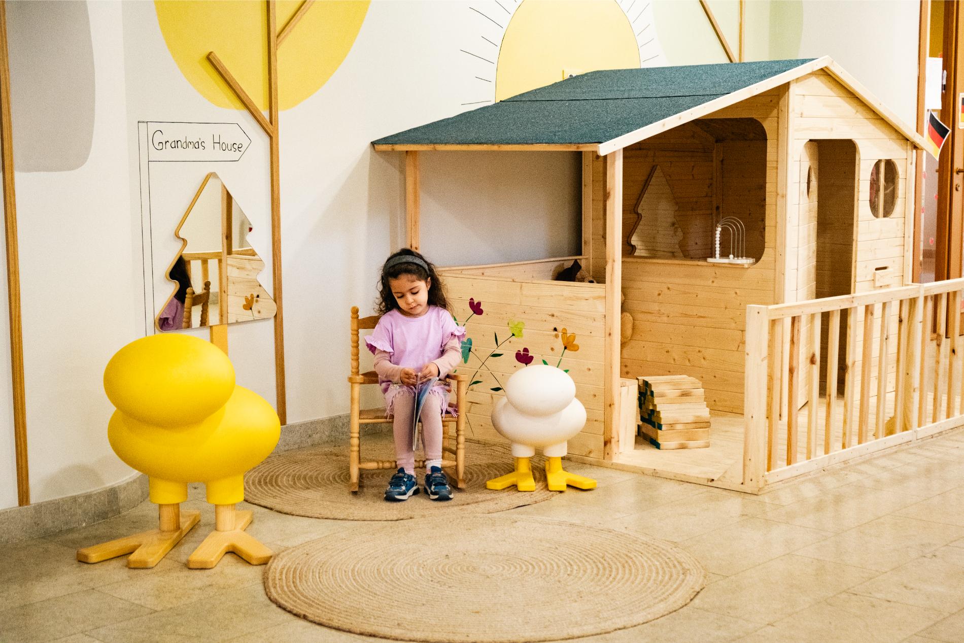
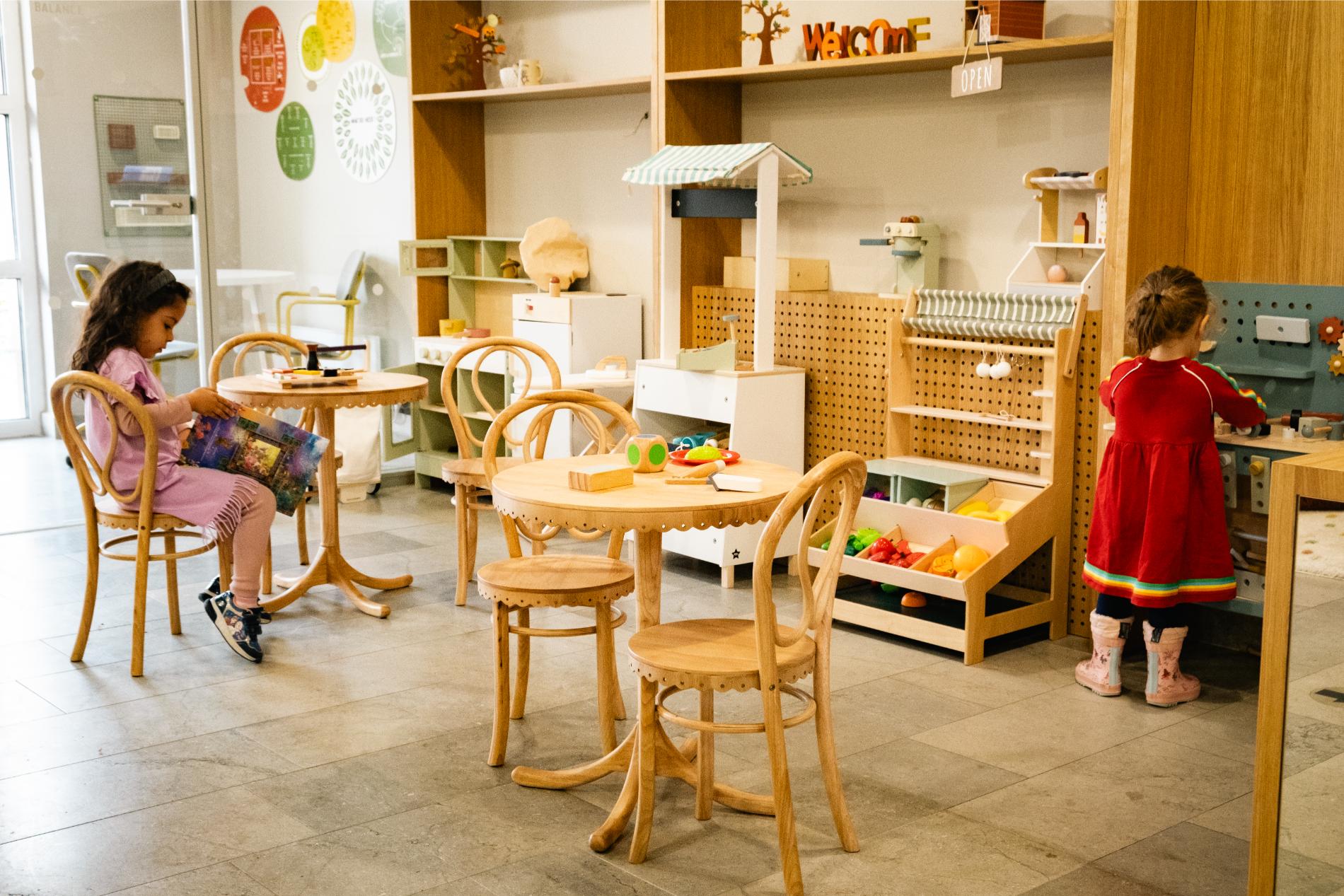
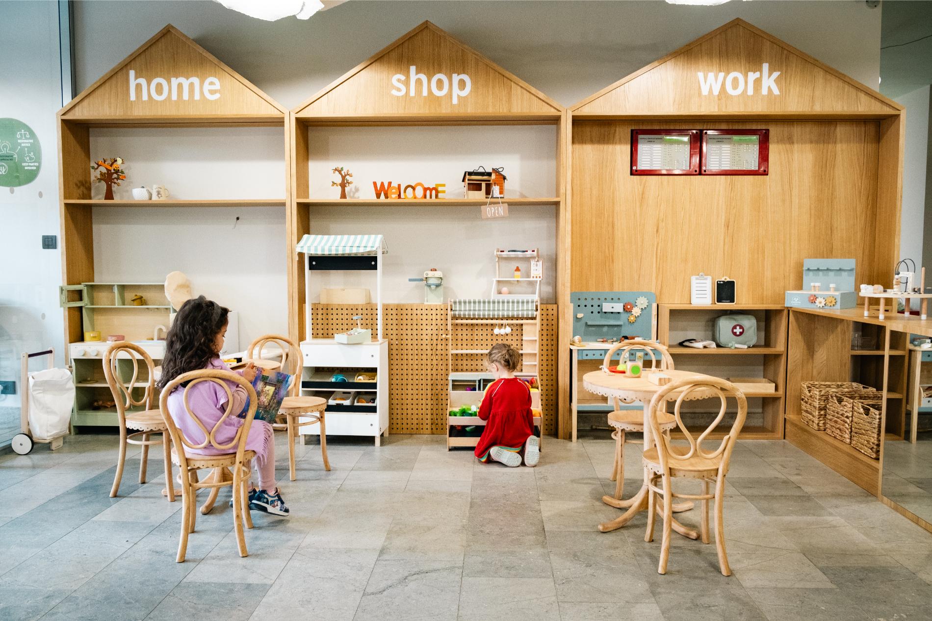
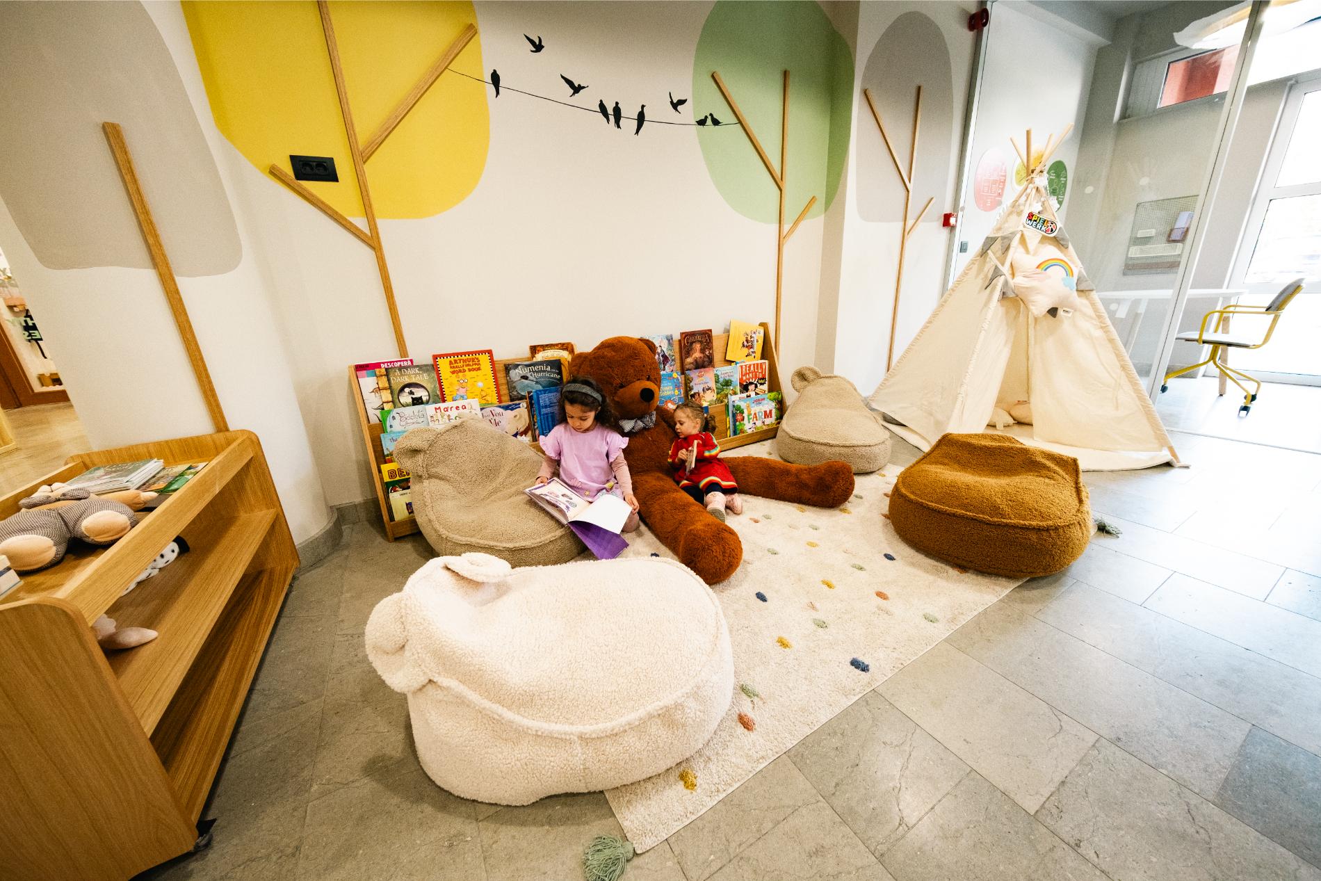
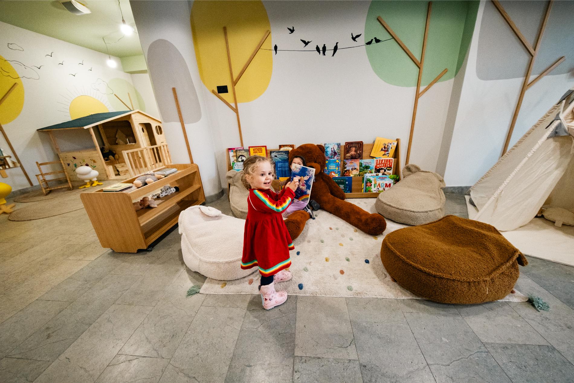
The first thing that greeted us at the entrance to the old kindergarten space was a reception area. Initially, when we started the design process, we looked at the space from an adult’s perspective, and it seemed natural to have a reception area in a kindergarten. We even began thinking about its new design and what it should look like. But then came a moment when we realized we needed to view the space from the children’s perspective—after all, they are the main stakeholders. That’s when a major shift happened in the way we approached the design, and we decided to center the entire concept around the idea of play—the key word being ”playground”.
Normally, we would start the design process with the furniture, but this time, we began with the toys. We carefully considered which ones were more educational, which weren’t, why we should choose wood over plastic, and so on. For a few hours, we felt like children again, delighting in picking out, arranging, and preparing the toys for the little ones. It was a bittersweet moment for all of us when we realized that, when we were kids, we didn’t have the same kinds of toys, but we were happy knowing that now they would.
The result turned out to be spectacular, and the new layout of the kindergarten is truly loved by the children, who explore each corner with curiosity and fascination.
The same magic took place in the nursery area—it’s a playground, a children’s universe where everything is designed with them in mind. One interesting feature is the kitchen, which we designed for both adults and children (it has two sinks at different heights, making it easily accessible for both groups). The playhouse with a slide, activity zones, mobile and reconfigurable furniture, and dozens of toys to suit all tastes and interests all come together to give this space a touch of magic, allowing the children to create their own fairy-tale world.
