Confident Choices Start With a Thoughtful Color Palette
The most important part when designing your new space, whether it’s an office, factory, restaurant, or school, is choosing the right color scheme.
When people walk into a room, color is the first thing they notice – and it leaves a lasting impression. The right colors can influence productivity, safety, comfort, and even how people learn or collaborate. But with so many options, making a confident choice can feel overwhelming.
It’s normal to feel uncertain, because color decisions are rarely straightforward. The good news is that with the right approach, we guide you to make the choices that feel confident, intentional, and aligned with your goals.
Color is not about taste.
Many people treat color as a matter of personal taste, but in reality, the right color combination depends on what your space needs to do.
A well-chosen color scheme can support focus, safety, collaboration, or learning, depending on the environment. Color is functional, psychological, and contextual.
By considering these factors, our approach enables you to make informed decisions that enhance the purpose and experience of your space, rather than relying on trends or guesswork.
Color psychology
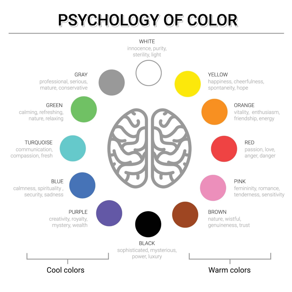
Understanding color psychology is the first step to creating any space that supports productivity and well-being.
While this may not be accurate for everyone, it’s essential to recognize that colors can significantly influence mood, perception, and even behavior.
- Blue promotes calm, focus, and mental clarity. Use it as an accent in workspaces, meeting rooms, and research areas to support productivity.
- Green reduces stress and eye strain while boosting creativity. It works well in areas where people spend long hours, such as desks, lounges, and relaxation spaces.
- Red is an energetic and motivating color, but it should be used sparingly. It’s best suited for high-activity areas like cafeterias, hallways, or late-night work zones.
- Yellow encourages optimism and creativity. Soft or muted shades are ideal for collaborative and creative spaces.
- White and neutral tones provide balance and brightness, serving as an excellent foundation for any color palette.
Our suggested framework
1. Start with a Focal Point
If you are redesigning a space, whether it’s an office or an industrial area, you can begin with one thing you really love in the space. Maybe a bold piece of furniture, a funky artwork, or even a colorful piece of machinery. Let its colors guide your palette. This way, everything else will feel like it belongs, and the space won’t look like a random jumble of colors.
If you’re starting from scratch, focus first on the purpose of the space. What do you want people to feel or achieve there? Using principles of color psychology as a guide, you can make choices that support focus, collaboration, creativity, or relaxation. We’re here to provide insights, tools, and suggestions, but the final decisions are yours: creating a space that truly reflects your vision.
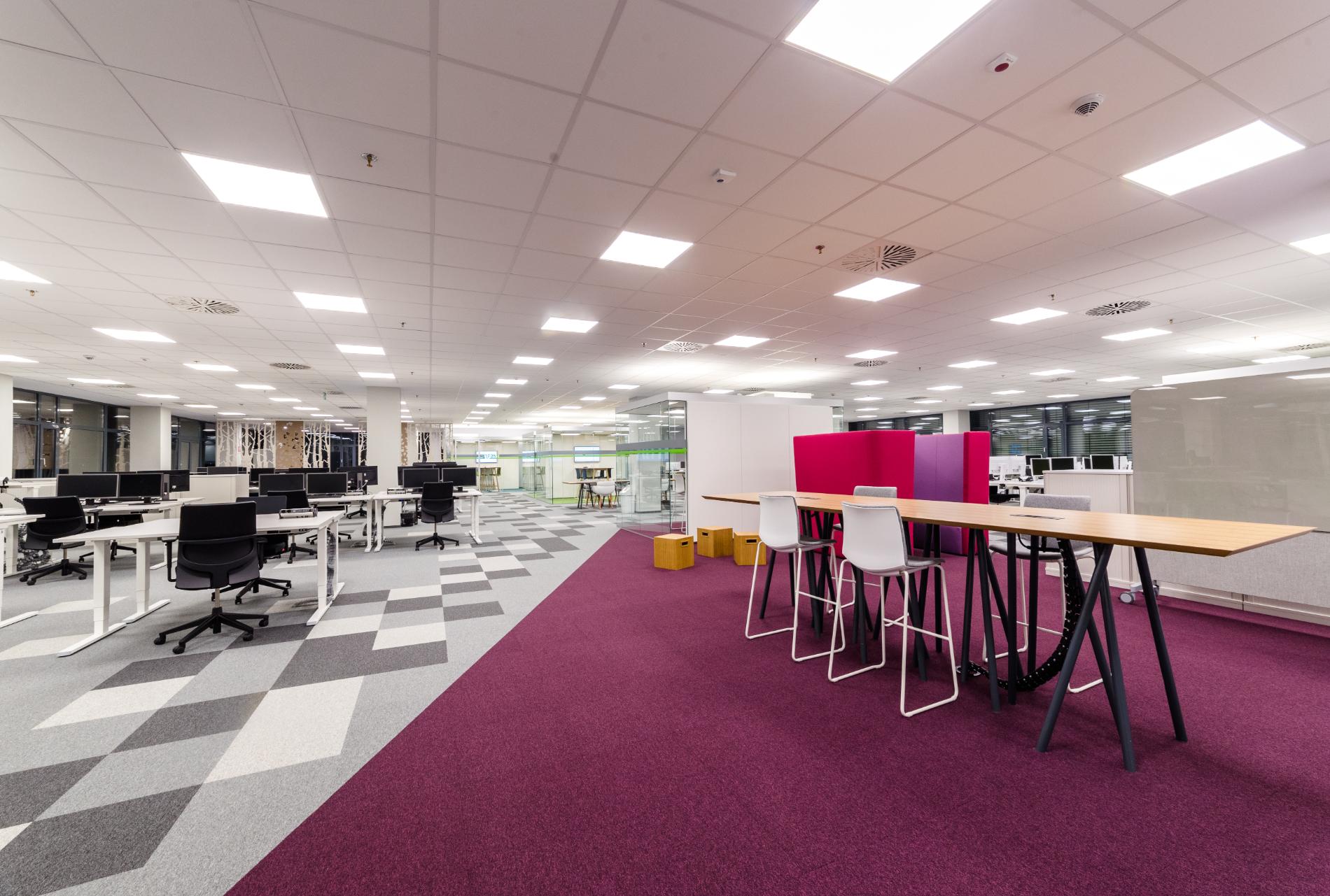
2. Play by the 60-30-10 Rule
Here’s our tried-and-true interior design formula (sometimes we use it without even thinking):
- 60%: Your main color (think walls, big furniture, or main surfaces).
- 30%: Your secondary color (accent walls, smaller furniture, or structural features).
- 10%: Your fun pop of color (decor, signage, or small details).
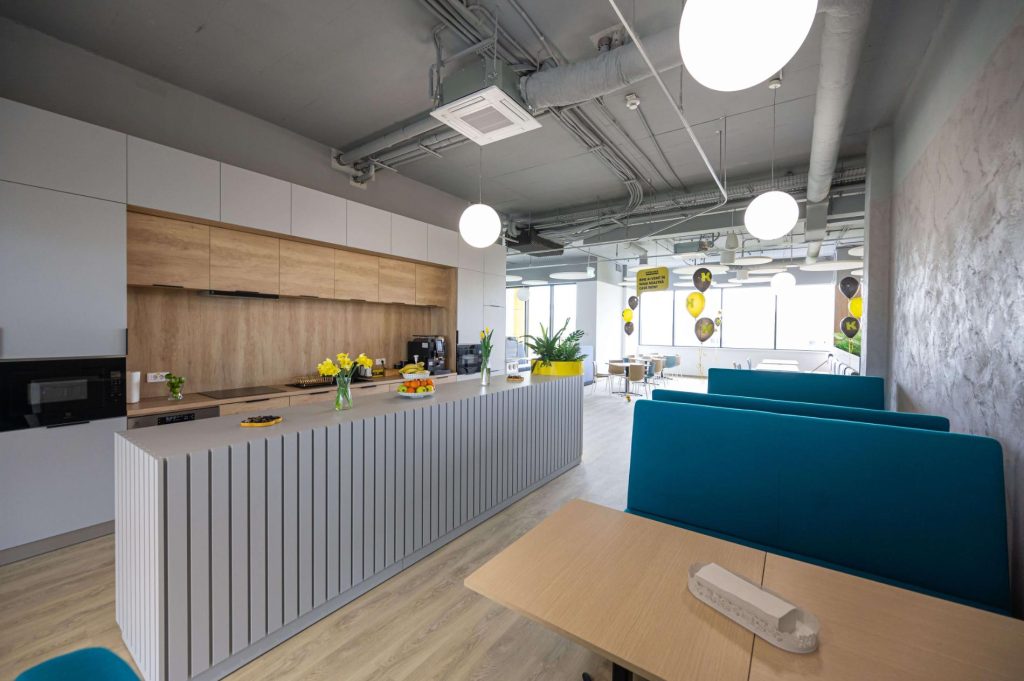
Follow this rule and your space will look balanced, intentional, and Instagram-worthy. Even if it’s an office or a factory floor.
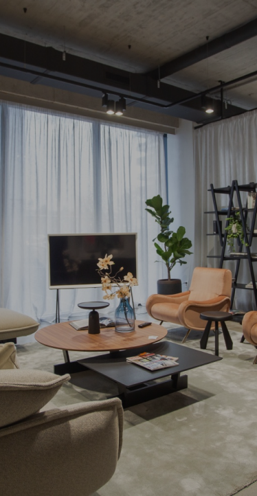
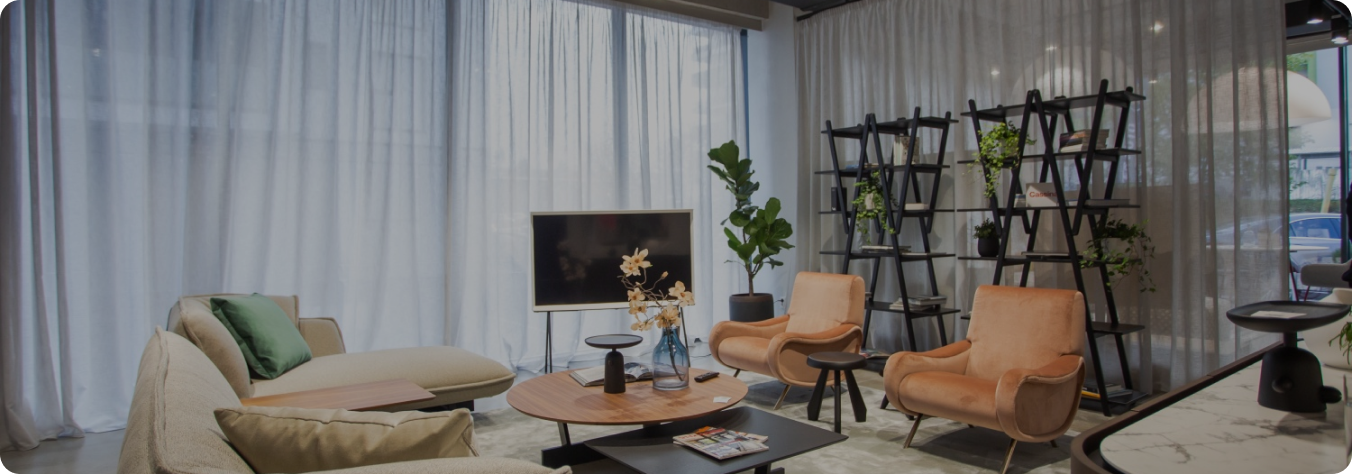
Take a look at one of our projects in the image above. Here, you can easily recognize this magic rule.
3. Let There Be Light
Colors can be sneaky. Natural sunlight in the morning can make a wall look dreamy, but that same wall under fluorescent office lights? Not so much.
Try observing your colors at different times of day, or test small samples on walls first. We can help you select which spots to test and interpret how the colors will behave in your space, so you make choices that feel intentional and confident.
4. Match Colors to the Space’s Mood
The function of the room should steer your choice:
- Offices: Green can help focus, yellow sparks creativity, and a touch of blue keeps things calm.
- Industrial Spaces: Industrial offices don’t have to be boring. Even in factory or production environments, thoughtful pops of color can reduce fatigue and make the workspace more inviting.
- Schools/Classrooms: Bright and warm tones energize, while soft pastels calm little learners.
Mistakes to avoid
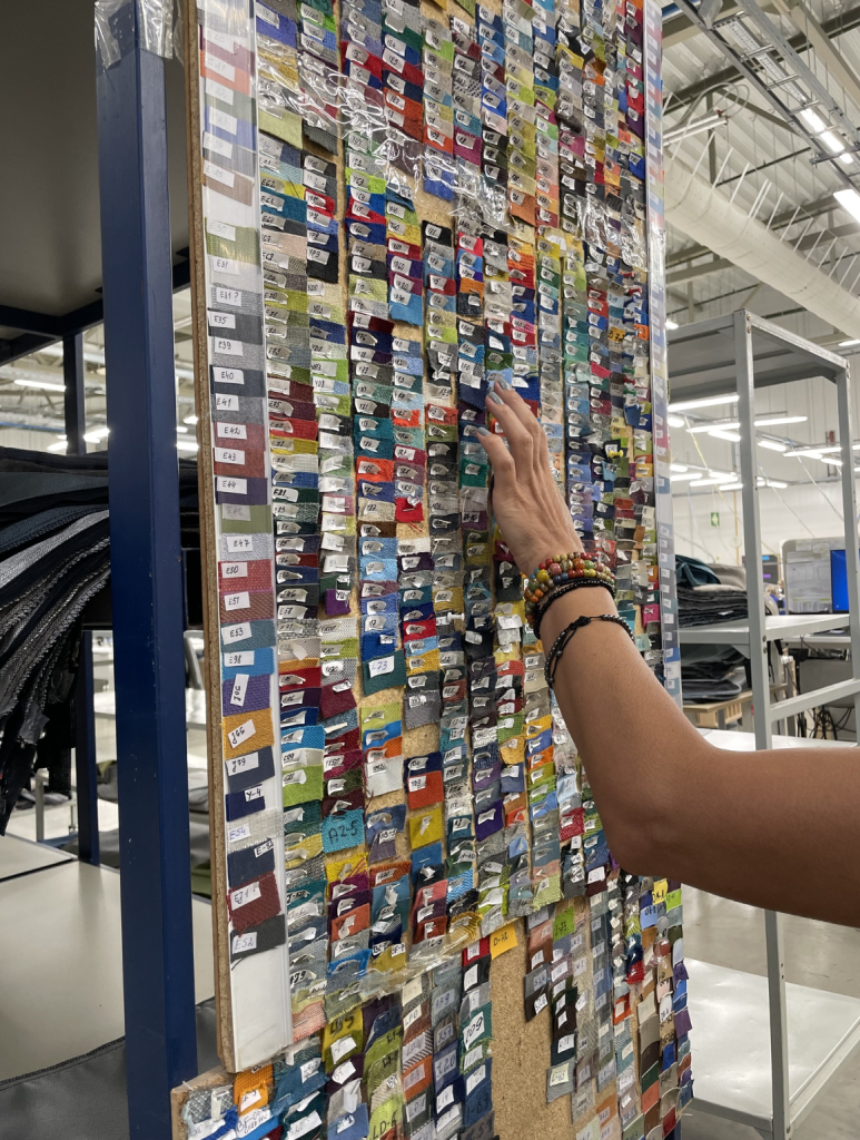
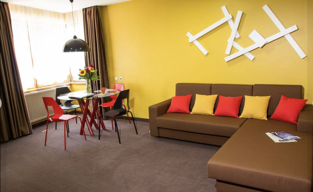
Some context for the photo above: this is an archive from one of our old projects, where we made some… interesting color choices. Imagine walls, furniture, and every little detail all trying to compete for attention at once… a real “design overachiever” moment😅.
Here’s what we learned from those days:
1. When everyone wants the same thing, design stops being design.
Following trends too closely might feel safe, but it erases identity. If all offices look identical, where’s the personality?
2. Color should be flexible, not permanent.
Back then, color ruled walls, desks, and furniture. Today, we use color in accessories and accents (refer to the 60-30-10 rule), so spaces can breathe, evolve, and stay fun without feeling like a time capsule from 2005.
3. Overwhelming the room.
Too much bold color at once can feel chaotic. Stick to one or two statement colors and balance them with neutrals. Your eyes (and brain) will thank you.
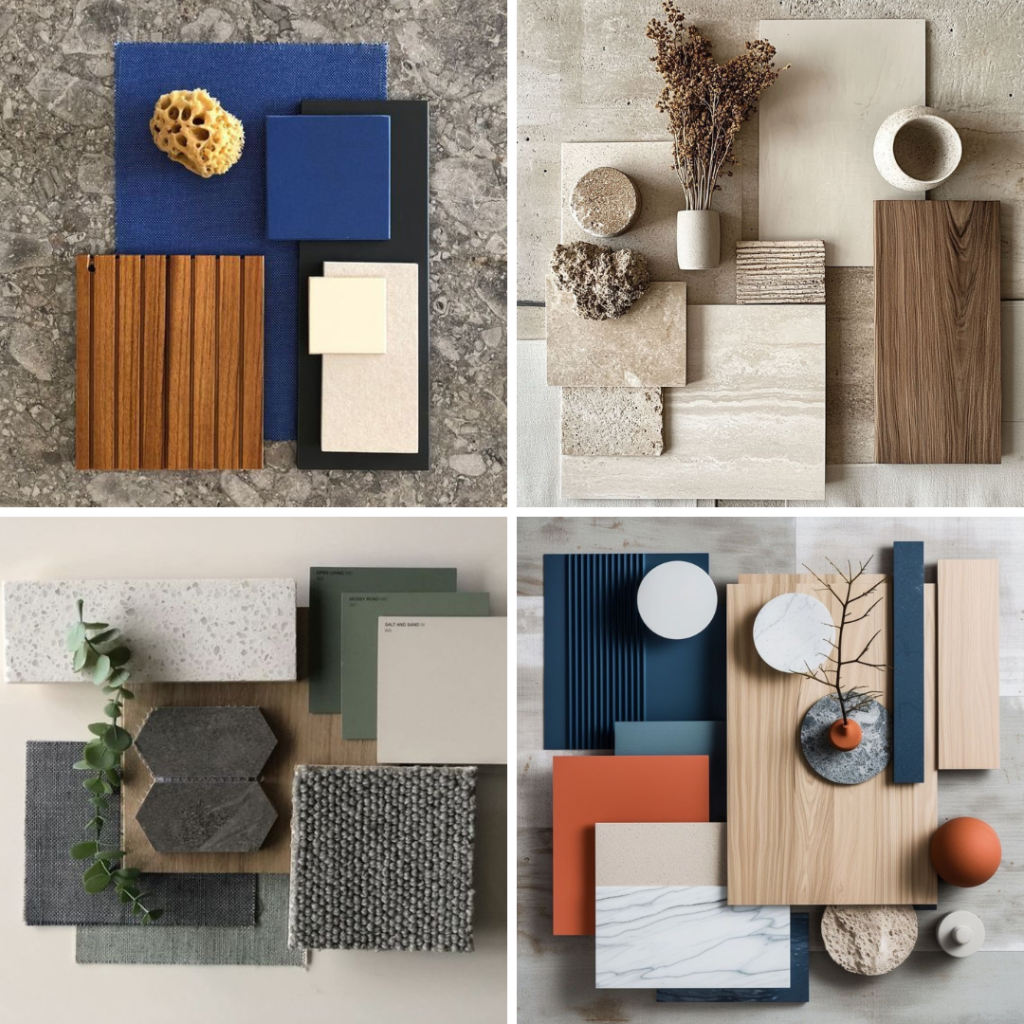
Feeling inspired?
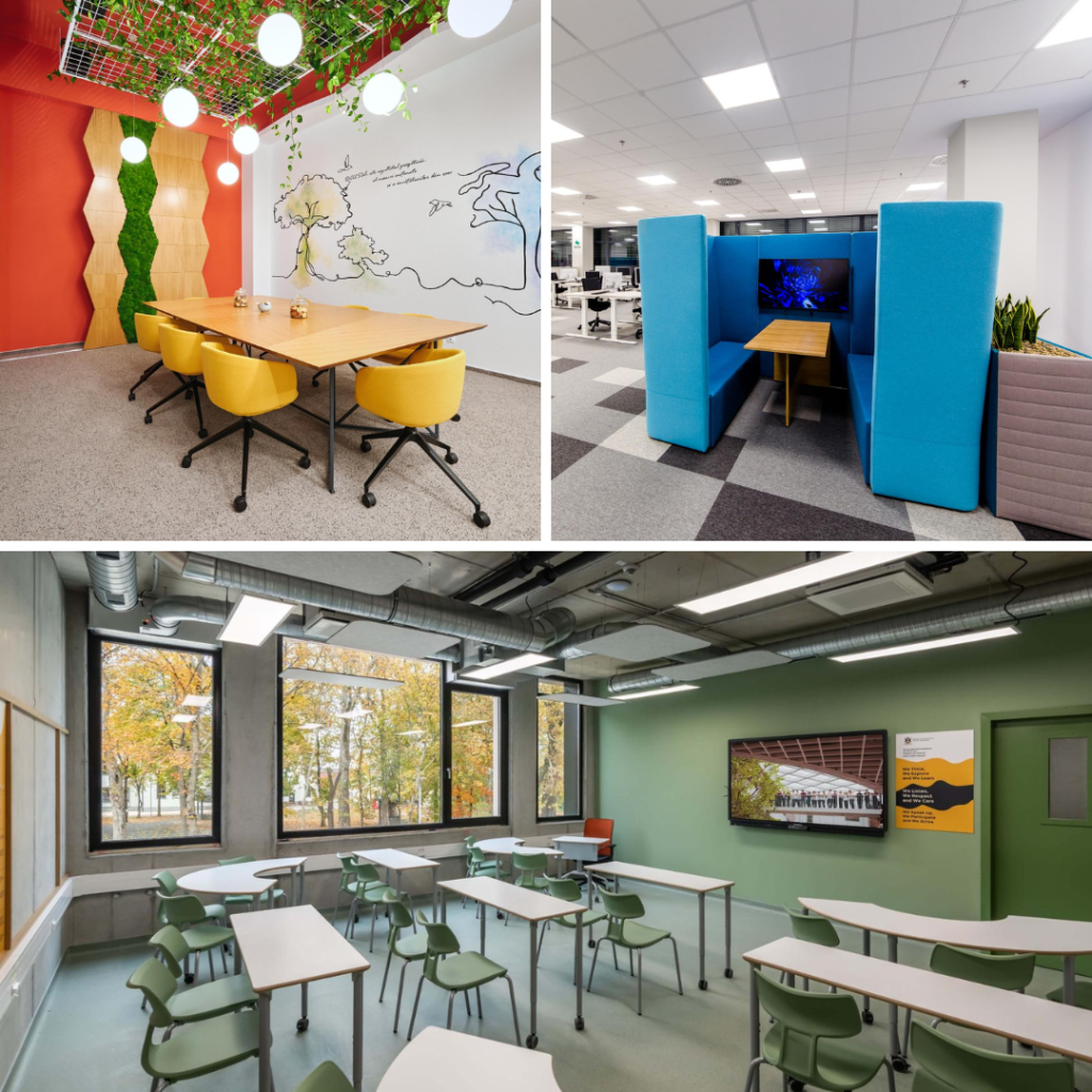
We curated a few examples of color palettes for your potential space to spark ideas!
Want help turning inspiration into a plan?
We’ve created a short questionnaire to help you pinpoint priorities, understand your team, and clarify your goals.
Click here to fill in our form! (Scroll down to the end of the page to find it.)
Share: